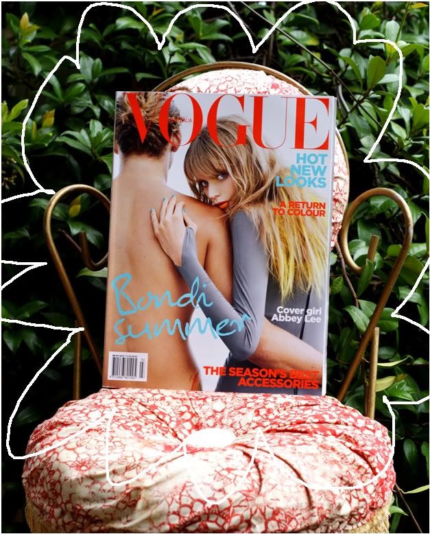
 The price was higher and it didn't come with a Spring/Summer catalogue. But this is one of the strongest cover's I've seen.
Standing in the news agency, I am ceaselessly faced with the plebeian strife of being surrounded with a wonderful array of magazines but with only enough dough to purchase one (or not eat). And as a big fan of food, I often find myself analysing the magazines in front of me more so than your average "I'll get today's telegraph and a blue travel 10 thanks mate," person. And after a decent amount of flicking-through time, it was the cover that won me over.
Let me elaborate, if you will...
The orange-red of the title stands out and screams summer, energised, refreshing & brings out the colour of model, Abbey Lee's lips. The same colour is used at the bottom of the cover, making your eyes dart down. Once down there, you can't possibly miss the big blue "Bondi Summer" which firstly is great for the global market - can you imagine being in a winter country and seeing this cover on a newsstand? After the flash floods of San Diego, I can vouch this by saying it would have been an oasis.
It's not a pretentious studio shot, and even though there is a man on the cover, I don't find it womanising in the slightest. Once at the "Bondi Summer", eyes are led diagonally, guided by Abbey's blue fingernails, up to the matching "HOT NEW LOOKS". Of course eyes then fall down to "A Return to Colour" which yes, is placed on yellow highlighted hair as if to say "we rest our case". And finally, if it wasn't this that you saw in the first place, Abbey Lee's face - striking, curious, not in the least bit cheesy or staged. Her eyes are the same grey as her dress, and her arm, in the shape of an arrow leads you back down and before your know it, you're circling the whole page again.
I have just proof-read this and let me just say, that although this may seem like an irrelevent tangent, now that magazines are almost the same price as Popular Penguins this kind of thought, I find, is required.
wow! good one! it looks great :D
ReplyDeleteHi :)
ReplyDeleteSuch a strong cover. I love it. I thought the editorial was good too!
ReplyDelete